Chapter 8. Some Design Features
BEYOND DRAWING and animating shapes, SVG has several features that can alter how the image ends up looking. We’ll review four of them.
FILTERS
You may already know that CSS has filters. For instance:
.grayscale-me {
  filter: grayscale(100%);
}
SVG probably looks at those and is like: “Cute, kid.” SVG filters are the original gangsters of filters. A similar filter defined in SVG would look like this:
<filter id="grayscale">
  <feColorMatrix type="saturate" values="0" />
</filter>
You can then apply that via CSS like so:
.grayscale-me {
  filter: url("#grayscale"); /\* space separate   multiple filters \*/
  /\* or in an external file \*/
  filter: url("filters.svg#grayscale");

  /\* you could even use a data URI here! \*/
}
Or you can apply it to an SVG element, like this:
<g filter="url(#grayscale)">
  <!-- grayscale all the stuff in here -->
</g>
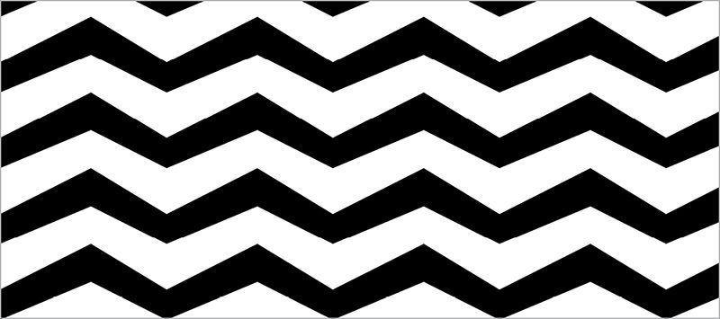
With a filter like that available, it would be easy to design an interaction where, for instance, there is a grid of Adorable Avatars in grayscale; the one being hovered over or tapped goes back to full color, as shown in FIG 8.1 (http://bkaprt.com/psvg/08-01/).
img {
  filter: url("#grayscale");
}
img:hover, img:focus {
  filter: none;
}
While CSS filters may be a bit easier to use, SVG filters can do anything that CSS filters can, and with deeper browser support.
The practical stuff, like blur, is all there in SVG filters (FIG 8.2):
<filter id="blur">
  <feGaussianBlur in="SourceGraphic" stdDeviation="3" y="-"/>
</filter>
But things can quickly get complex. Here’s the “color matrix” required for converting colors to sepia tone (FIG 8.3):
<filter id="sepia">
  <feColorMatrix type="matrix" values=".343 .669   .119 0 0 .249 .626 .130 0 0 .172 .334 .111 0 0   .000 .000 .000 1 0" />
</filter>
Or something really weird and otherworldly, like adding “turbulence” (FIG 8.4):
<filter id="turbulence" >
  <feTurbulence type="fractalNoise"   baseFrequency="0.015" numOctaves="2"   result="turbulence\_3" data-filterId="3" />
  <feDisplacementMap xChannelSelector="R"   yChannelSelector="G" in="SourceGraphic"   in2="turbulence\_3" scale="65" />
</filter>
And we’re just getting our toes wet. Note how the turbulence filter included two filter operations. Filters can include any number of operations, each affecting the last. As Chris Lilley told me in an email: “In some ways [filters] are more like a flow-based programming language than markup.”
Lucas Bebber built some beautiful “Gooey Menus” with SVG filters that are fun to explore (http://bkaprt.com/psvg/08-02/). They combine blurring and deblurring and shadowing and compositing and all kinds of fancy.
There is practically no limit to what SVG filters can do to graphics. If this appeals to you, I’d encourage you to check out the spec (http://bkaprt.com/psvg/08-03/).
PATTERNS
Patterns are repeated designs. Imagine a polka-dot dress or those baggy chef pants with all the little different kinds of peppers on them that you used to wear in middle school and oh god the loneliness. Nobody laid out every single polka dot or pepper; they were created from patterned fabric.
Here are two reasons SVG patterns are cool:
- They make quick work of designs that would otherwise be too complex (too many points; too big a file).
- They are made from other chunks of SVG!
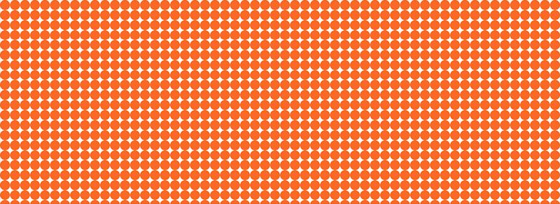
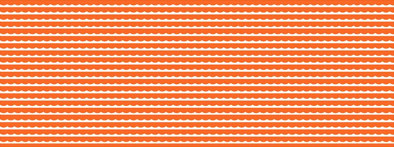
Imagine a repeating site background (FIG 8.5). Very nice, you think to yourself, but can I use SVG for that? It seems like an awful lot of vector points; the file size is probably too big to be practical. That would be an understandable thought, but this file is only about one kilobyte. That’s because we made that complex-looking pattern from one tiny little shape (FIG 8.6).
The pattern element provides the magic here. It’s an element designed to be used as a fill that will repeat over and over in a grid, like CSS background-images can. A pattern is essentially a rect. It takes the same attributes: x, y, width, and height. The difference is that it doesn’t render all by itself, just like the symbol element we used back in Chapter 3! You give it an ID so other elements can reference it.
Any SVG element that does render can use the pattern as a fill. Here, let’s fill the entire SVG area with circles:
<svg width="100%" height="100%">

  <!-- this rectangular area won’t render,
       but anything drawn inside of it can
       be used to fill other shapes -->
  <pattern id="pattern-circles"   x="0" y="0" width="20" height="20"   patternUnits="userSpaceOnUse">
    <circle cx="10" cy="10" r="10" fill= "#f06d06" />
  </pattern>
    <rect x="0" y="0" width="100%" height="100%" fill="url(#pattern-circles)" />

</svg>
Note the patternUnits="userSpaceOnUse" on the pattern element. That ensures that both the pattern and the element using the pattern exist in the same coordinate system (x, y, width, and height). In my experience, this prevents a boatload of confusion. If you ever find yourself in a situation where you want a pattern to have its own new coordinate system, look into the objectBoundingBox value for the patternUnits and patternContentUnits attributes.
In FIG 8.7, the circle repeats perfectly, just touching the next circle in the pattern. That’s because the width of the circle (radius × 2) and width of the pattern rectangle are exactly the same. And the circle is positioned in the middle of that pattern rectangle.
What if we move the center of the circle to 0,0? Then we’ll only see the bottom right corner of the circle, because that’s the only part of it that’s visible within the pattern rectangle. Anything outside of that area is cut off (FIG 8.8).
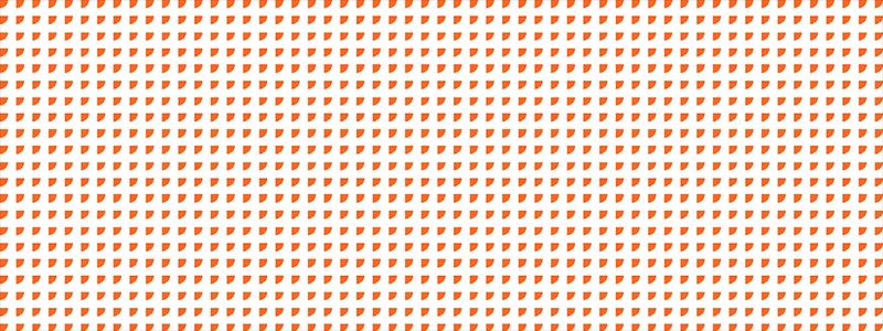
Or say we increase the radius of the circle beyond the edges, and position it centered at the top. Our pattern might then resemble curtains (or waves) (FIG 8.9).
I’ve set up a playground for playing around with these pattern attributes (http://bkaprt.com/psvg/08-05/).
Illustrator has a pretty good tool for working with patterns, and thankfully it also saves to SVG well! If you go to Object > Pattern > Make, the Pattern Options panel will open, and the interface will shift into pattern-editing mode (FIG 8.10).
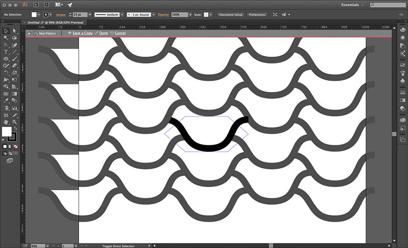
First you make the pattern (click Done at the top of the screen when you have it how you want it); then Illustrator makes a new “swatch” for this pattern under the Swatches panel. Now you can create or select other elements and apply this pattern to them, just like you would in the SVG syntax with fill="url(#pattern)".
What is especially useful about working with patterns in Illustrator is that we aren’t limited to the repeating rectangles. You can define a pattern with offset rectangles (like a brick wall) or a grid of hexagons. This opens up some pretty cool pattern opportunities (read: almost any design set in repeating hexagons looks cool). SVG still only supports repeating rectangles through pattern, but that’s precisely what is wonderful about Illustrator: it does the hard work for you of converting that pattern to one that can be represented as a rectangular tile, such that it can be drawn with pattern.
You probably know you can create repeating patterns in CSS as well. In fact, the default is background-repeat: repeat. You can simply create a rectangular bit of SVG and repeat it that way, which is a pretty great option if you’re already using the pattern as a background. Otherwise, in order to set other content on top of the pattern set in inline SVG, you’d have to position it into place on top using position: absolute;—a rather blunt tool for the job.
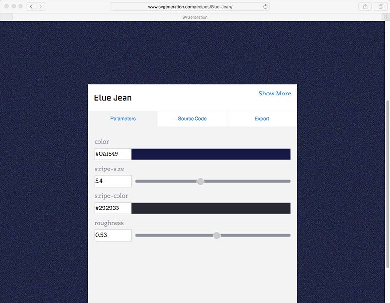
If you’d like to play around more with pattern, SVGeneration is a pretty neat site for that, providing patterns that make use of features unique to SVG, as well as a UI to customize them and show you the code (svgeneration.com).
CLIPPING AND MASKING
Clipping and masking are related concepts because they are both capable of hiding parts of an image. But the distinction between them can be confusing, so let’s clear that up right now:
- Clipping is created from vector paths. Anything outside the path is hidden; anything inside is shown.
- Masking is created from images. Black parts of the image mask hide; white parts show through. Shades of gray force partial transparency—imagine a black-to-white gradient over an image that “fades out” the image.
Clipping is done with the clipPath element. Any SVG elements you put inside of the element don’t render all by themselves (again, like symbol), but can be applied to other elements to clip them.
Let’s say we have a polygon of a star shape (FIG 8.12). And we also have a bunch of other fun SVG shapes laid out (FIG 8.13). We can use the star shape as a clipping path for the circle shapes (FIG 8.14):
<svg viewBox="0 0 1200 1000">
  <defs>
     <clipPath id="clip-star">
       <polygon points="..." />
     </clipPath>
  <defs>
  <g clip-path="url(#clip-star)">
    <circle ... />
    <!-- all those cool circles -->
  </g>
</svg>
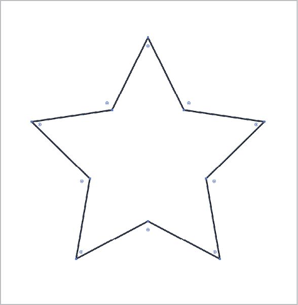
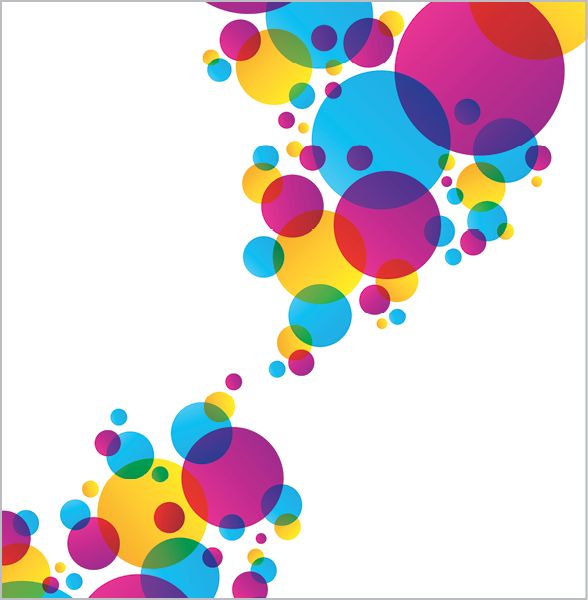
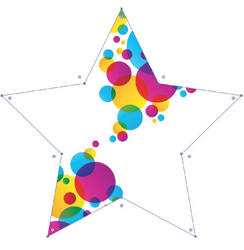
FIG 8.14: The star shape being used as a clipPath for the circles.
In Illustrator, you can apply clipping paths like this by selecting multiple elements, making sure the topmost element is the clipping path you want to apply, and going to Object > Clipping Mask > Make. Note that Illustrator calls it a “mask” here, but it’s actually a clipping path.
A clipping path is black and white in the sense that the part of the image being clipped is either hidden entirely or shown entirely. A mask is a bit different. A mask covers the entire area with an image of its own. Where that masking image is black, it hides the image below (and prevents user interaction as well, a sort of pointer-events: none;). Where that masking image is white, it reveals the image below. Any grays in that masking image partially reveal the image, depending on their value.
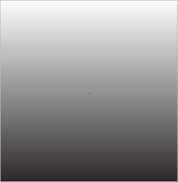
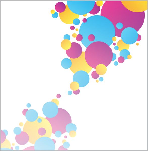
Perhaps the easiest way to make this distinction is to picture a white-to-black gradient (FIG 8.15).This gradient can be created in SVG and applied to a rect, and then put inside a mask element. If we apply that mask to the same fun circles we were working with before, we get some nice results (FIG 8.16).
The code looks like this:
<svg viewBox="0 0 1200 1000">
  <mask maskUnits="userSpaceOnUse" id="fade">
    <linearGradient id="gradient" x1="0" y1="0"     x2="0" y2="100%">
      <stop offset="0" style="stop-color: #FFFFFF" />
      <stop offset="1" style="stop-color: #000000" />
    </linearGradient>
    <rect fill="url(#gradient)" width="100%" height="100%" />
  </mask>
  <g mask="url(#fade)">
    <circle ... />
    <!-- all those cool circles -->
  </g>
</svg>
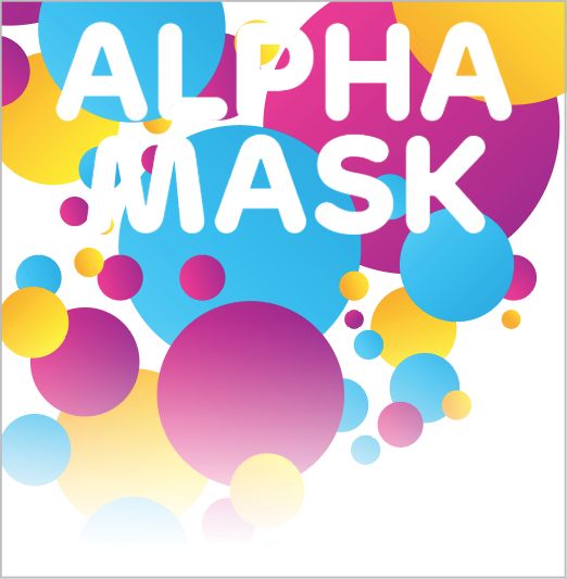
FIG 8.17 shows a photographic image applied as a mask, yielding a pretty wild outcome. A mask lets you do the same thing a clipping path does: you can fill the shapes you make with black or white as needed, and you can reverse the mask by simply reversing the colors. But masks are a bit more flexible—unlike clipping paths, masks can do partial masking.
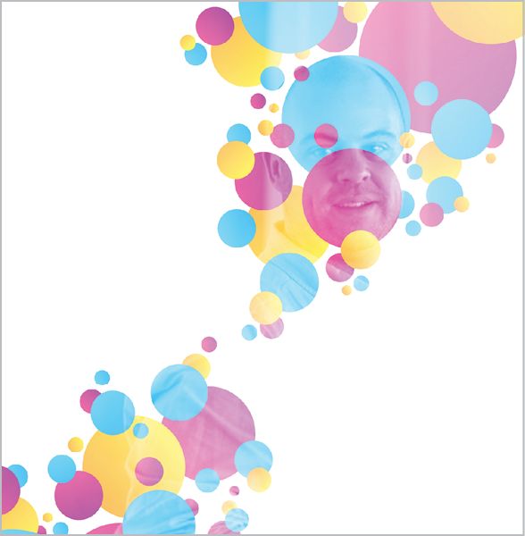
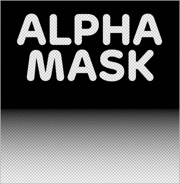
Masks have another distinctive feature: they have two different types. We already looked at the default, mask-type="luminance", which is based on color. There’s another one: mask-type="alpha". Alpha masks don’t take color into account, only the alpha channel itself. For instance, if you use an SVG element as part of a mask with no fill at all, that’s considered fully alpha transparent and will show the image beneath (http://bkaprt.com/psvg/08-06/).
You can use raster images as masks if you want (FIG 8.18):
<mask maskUnits="userSpaceOnUse" id="fade" mask-type="alpha">
  <image y="200" width="100%" height="500"   xlink:href="alpha-mask.png" />
</mask>
Peter Hrynkow has a very clever technique utilizing SVG masks (http://bkaprt.com/psvg/08-07/). Say you want a photographic image, and JPG is the best choice in terms of file size and quality. But you also want alpha transparency around the edges of the subject in the photograph. You could save from Photoshop as a “PNG-24,” but then the file size will be a lot bigger than it would be with JPG.
Hrynkow’s solution is to use two images. The photograph, and a black-and-white image as the mask. Then apply that mask in inline SVG!